

Less than 1 minute ago
\r\n \r\n Great job.. I would have a few critiques on pic choices etc... But the work is really nice\r\n
|
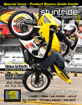
my first poster
|
Less than 1 minute ago
\r\n \r\n Great job.. I would have a few critiques on pic choices etc... But the work is really nice\r\n

Less than 1 minute ago
\r\n \r\n thank you dan wanted stoppie pics i want to use others but i just trew it together\r\n

Less than 1 minute ago
\r\n \r\n Too much going on with the bottom small pic. I would use a variation of different tricks rather than all endos.\r\n
Less than 1 minute ago
\r\n \r\n I Like It .... Really Busy ... But The Stoppie Frame Pics Almost Look Like The Same Pics .. Not A Rapid Shot .\r\n
Less than 1 minute ago
\r\n \r\n thanks sean its not the same but see what you mean plus its prolly not good to have red bull in the back ground of a rockstar sponcered rider oh well\r\n
Less than 1 minute ago
\r\n \r\n -Main image is underexposed.
\n-Bottom right shot appears to be stretched too far, width wise. \n-The SR shield behind the main image is extremely pixelated, and poorly cut around the rider\'s right elbow. \n-As mentioned, should probably use more than just endo shots. \n \nI\'d also find a better way of laying out the sponsors, so they don\'t appear like you just squeezed them in the only open space. \n \n  \r\n \r\n
Less than 1 minute ago
\r\n \r\n Looks good to me, other than too many stoppies :D\r\n
|
|
« Next Oldest | Next Newest »
|